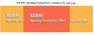
The kind words from some of you guys really makes me wanted to write more advance tutorial but i really have limited time. Nonetheless, i will try my best to write at least 1 tutorial in the most easiest and detail form as much as i can. In this tutorial, i will show you a more advance trick to perform a opening/closing door effect. This tutorial will deal with viewport to perform such effect and may get a little confusing. The demo is as usual at the bottom of the tutorial. If you would like to view the demo first before reading, please proceed to the bottom of this tutorial instead.
Concept
Imagine you have a sliding door, one left and one right. In order to open/close this particular door, we have to pull or push both door so that it will open or close completely. This is the usual case for a door to open and close which required two image of door left and right. How can this be done? The concept behind this technique is not similar to the zoom tutorial i did previously. But let's just concentrate on what is a viewport. A viewport is just a viewable area on the screen to the user, anything outside the viewport is considered unseen by the user. Using viewport, we will try to hide the two sliding door left and right outside the viewport and when the user clicks on the image, the door will automatically be called in and closed the door to create a nicely done closed door effect. The opening door effect will be exactly the same with the additional step to open the door after the door is closed.
CSS and HTML
I believe the CSS and HTML structure should be the same as the shuffle effect tutorial i wrote previously.
Coding
The coding part may get a bit confusing for the viewport technique. But i will try my best to cover it with simplicity as much as i can. If there is any doubt you may have you can really comment below and i will try to reply you within the day if possible. On the CSS Coding,
body{
margin: 0 auto;                    /*align the header at the center*/
text-align: center;                /*align the header at the center*/
}

div.image
{
width: 600px;                    /* width of each container*/
height: 350px;                    /* height of each container*/
position: absolute;                /* instructure each container to obey the position absolutely*/
float: left;                    /* float all the container so that they overlapped each other*/
left: 27%;                        /* align them to the center of the screen */
z-index: -1;
}

div#box1
{
background: #66A666 url('../images/blue.png');
}
div#box2
{
background: #E37373 url('../images/green.png');
}
div#box3
{
background: #B2B2B2 url('../images/orange.png');
}
div#box4
{
background: #A51515 url('../images/red.png');
}
Notice that everything above are images and if images are not displayed yet, a color will be shown instead. Other important stuff are self explained on the comment i wrote in the code. For the HTML structure,
<div class='image' id='box1'></div>
<div class='image' id='box2'></div>
<div class='image' id='box3'></div>
<div class='image' id='box4'></div>
There will only be the container in the HTML structure similar to the shuffle effect tutorial. Supposely, it should have more than just 4 block of div as we need a viewport for each container. But for simplicity, i will just write 4 block here and leave all the complex stuff with jQuery. On the jQuery side,
//below here preload the image in the simplest form
$(function(){
for(i = 1; i < 5;i++)
{
var img = new Image();
img.src = 'images/images/d_left_'+i+'.png';
$(img).load();
}

var i = -1; //deep of the image
var no = 0; //image number

//attach event handler on each container/image
$('div.image').click(function(){
var Obj = $(this);
no++;
if(no > 4)
no = 1;

// viewport structure
Obj.wrap('
<div id='viewport'></div>
');
Obj.css({left: 0+'px'});
$('#viewport').css('overflow','hidden');
$('#viewport').width(Obj.width());
$('#viewport').height(Obj.height());
$('#viewport').css('left','27%');
$('#viewport').css('position','absolute');

// left door structure
$('#viewport').append('
<div class='GrpEffectDiv' id='doorLeft'/>');
$('#doorLeft').css('position', 'absolute');
$('#doorLeft').css('background', '#000 url('images/images/d_left_'+no+'.png')');
$('#doorLeft').width(Obj.width()/2);
$('#doorLeft').height(Obj.height());
$('#doorLeft').css('left', '-'+300+'px');

//right door structure
$('#viewport').append('
<div class='GrpEffectDiv' id='doorRight'/>');
$('#doorRight').css('position', 'absolute');
$('#doorRight').css('background', '#000 url('images/images/d_right_'+no+'.png')');
$('#doorRight').width(Obj.width()/2);
$('#doorRight').height(Obj.height());
$('#doorRight').css('left', 600+'px');

// left door animation
$('#doorLeft')
.animate({left: 0+'px'},1000,
function(){
Obj.css('z-index', i);
$(this).remove();
});

//right door animation
$('#doorRight')
.animate({left: 300+'px'},1000,
function(){
$(this).remove();
Obj.css({left: '27%'});
$('#viewport').replaceWith(Obj);
});

i--;
});
})
Seriously, looking at the code i am starting to wonder whether i will be able to explain it in a simple term. Anyway, what the above code done is as follow,
- create a viewport around the container and became the parent of the container
- create the left door and append into the viewport ( doors became neightbour of the container)
- create the right door and append into the viewport
- animate both left and right door to close the door
- remove both door and subsituate the viewport back to the container with the original settings
I have also commented the code above so that you are clear what i am doing on the code itself. So how does the viewport be created by the code above? If you have read my sliding tutorial previously, it is similar to the frame concept, where there is a frame (viewport) to cover the outside of the viewport. If i remove the most important thing for the viewport to work which is
$('#viewport').css('overflow','hidden');
You will see that the left and right box is standing by on the right and left side ready to charge at the container to close the door.

Notice the right and left image which i made? These are the door of the next image, this way we can create a very nice effect as shown in the demo
.
Improvement
There maybe people who will disagree with this tutorial that all the styling is placed on the jQuery script itself when we can actually just add a class on an external script and give the class to the div block object itself instead. You can definitely do that to simplify the efficiency and flexibility of the code. The purpose why it is done this way is to avoid any complexity on the CSS section. Personally, it will just confuse me going to look up and down on the post to feature out what i am doing. So i place it in a chunk of code indent it nicely for me and everyone to understand.=) The other thing you can do to improve the above code is to apply chaining which i always did in a whole straight line. Imagine if i do it in my tutorial? won't be that nice to read isn't it? Another thing is the preloader in this tutorial, it is just pure load image and may not do as well as other great pre loader but it basically how preloader work in jQuery. Thus, you may see black door on the first time during your loading instead of the image of the door until it cache the image to your browser that it! =X You can do this for gate closing and opening effect as well, we just have to do it on the top and bottom instead of left and right. Anyway, hope you like this tutorial as well =)
File
You can find the tutorial files by saving the page on the demo site. But if you feel lazy, you can download from jquery-closing-opening-door-effect


