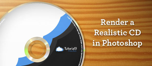
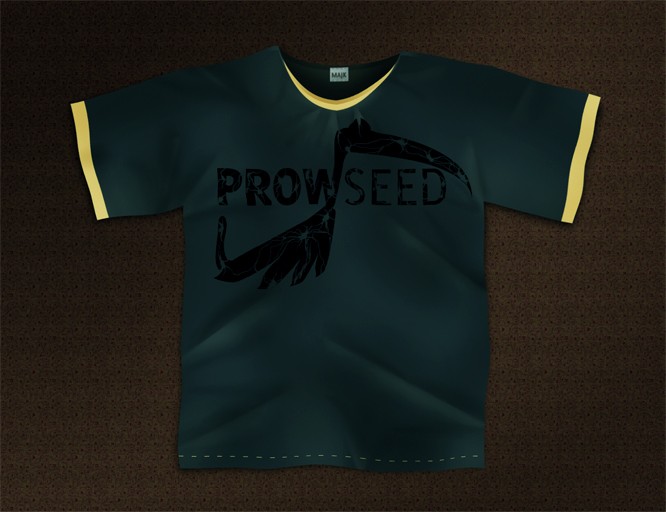
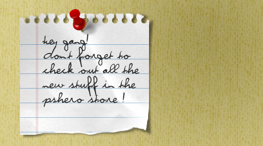
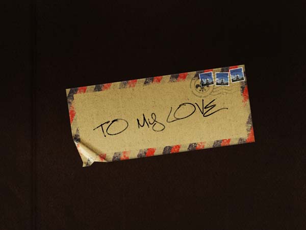
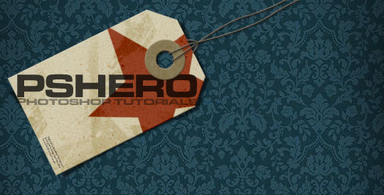
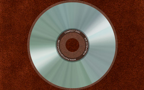
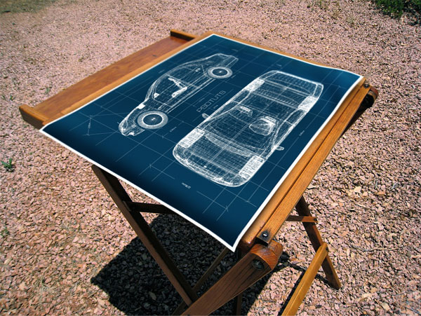
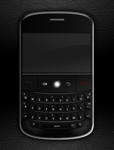
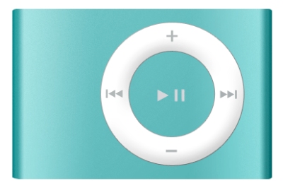
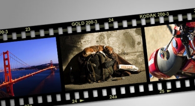
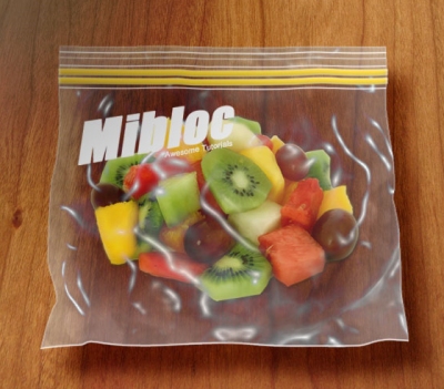
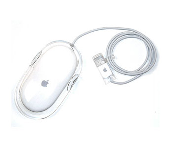
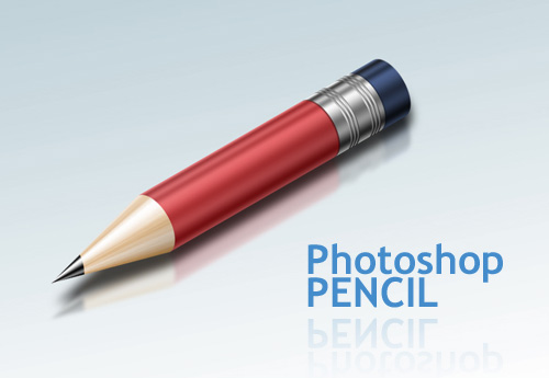
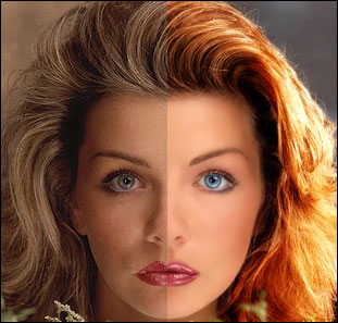
Photoshop has been widely used by designers nowadays to create realistic result on their work. In this post, we will feature 60 realistic tutorials that will help you learn some tricks for you to enhance some of your design work. These tutorials can also be used to improve your design skill or just use for any inspirational purposes.
 Clay
Clay
15 Excellent tutorial on Logo design in Adobe Illustrator
Logo design is one of the many basic of designers job. If you are wondering how other designers design their logo or what procedure did they follow, this may be the resources you are looking for. In this tutorial, we will bring you some of the excellent tutorial available for Adobe Illustrator on teaching and showing you some of their logo design work and procedure. Nonetheless, if you are trying to learn some technique for designing a logo with Adobe Illustrator, this is some good knowledge you must read.
Designing a logo from scratch part 1
Part 2
Photoshop CS2 Splash
Suns Logo
Swan Logo
How to Design a Logotype from Conception to Completion
Add Some Diamond Bling To Your Logo
Logo Design Process and Walkthrough for Vivid Ways
The Logo Design Process for Ultimate Potential
Design a Grungy Circular Logo
Creating a Rockstar Brand, Logo & Styleguide in Illustrator
Logo Design in Adobe Illustrator
Logo Design Project Step by Step Walkthrough
Goplan 2.0 logo creation process
BzZz, Create a Fly Logo Design Part 1
Raw Logo Design in Illustrator CS4
Tutorial: Simple Cross-browser tooltip with CSS
We see tooltip almost everyday on the web. And most of us know there are a lot of way of doing this. Personally, i think the easily way of accomplished this is by using CSS. Although there are disadvantage and advantages of doing this which we will discuss later. Nonetheless, it is one of the most easiest way of accomplished a tooltip. (although the MOST easily way is to just use a title attribute in the tag without any additional code)
The Concept
This method neglect the use of 'title' and apply 'span' tag instead. We know that span tag won't add additional break to a text (which is what we want!) and is usually used to highlight text on a particular paragraph. Therefore, span tag can be used perfectly to substitute title attribute although it cannot totally replace it. So what we do here is by placing the span tag within the anchor tag and style the span tag with a absolute position while the anchor will have relative position. This way, the span tag can have any position away from the anchor tag which provides a tooltip like position. The last missing puzzle will be using an pseudo class to perform a CSS hover on the anchor for displaying and hiding the tooltip. That's it.
The Code
The concept illustrate the basic use of this method. We can further enhance it to cater for more visual effect such as adding additional image on the tooltip.
The HTML
	<a href="#"> Mouse over me to see what i have to say!
	<span class='tooltip'>
	<span class='top'></span>
	<span class='middle'>this is a testing site to demonstrate how simple a tooltip be build without affecting the efficiency of the overall site. Only pure CSS implementation is required. No additional JavaScript is needed actually. Well, unless you want to do something different like dragging your tooltip around a particular images, you may consider using a simple jQuery or JavaScript code to accomplish that.</span>
	<span class='bottom'></span>
	</span>
	</a>
We will have an anchor and inside the anchor we will have two things, the link message and the tooltip. The link message is 'Mouse over me to see what i have to say!' which is quite obvious and the span tag will locate next to it. Actually we only need one span tag if we are doing a simple border tooltip without images but we want to enhance overall look of the tooltip so we need a few nested span within the main span tag as shown above.
The CSS
a {
    position:relative;
    color:#3CA3FF;
    font-weight:bold;
    text-decoration:none;
}
a  span{ display: none; }
a:hover{
color: #aaaaff;
background:;
}
a:hover span.tooltip{
    display:block;
    position:absolute;
    top:0px; left:0;
	padding: 15px 0 0 0;
	width:200px;
	color: #993300;
    text-align: center;
	filter: alpha(opacity:70);
	KHTMLOpacity: 0.70;
	MozOpacity: 0.70;
	opacity: 0.70;
}
a:hover span.top{
	display: block;
	padding: 55px 8px 0;
    background: url(../images/main_image.png) no-repeat top;
}
a:hover span.middle{
	display: block;
	padding: 0 8px;
	background: url(../images/content_image.png) repeat bottom;
}
a:hover span.bottom{
	display: block;
	padding:3px 8px 40px;
    background: url(../images/main_image.png) no-repeat bottom;
}
I will explain the CSS code above in point form
- 'a {...': We declare the basic of the anchor tag. eg. color, decoration, bold, position but the key is position relative as stated on the concept section
- 'a span{...': the tooltip should be hidden at first
- 'a:hover{...': We need to set the hover z-index and a small hack 'background:;' for ie.
- 'a:hover span.tooltip{..': this is the tooltip and the declaration of important are 'width', 'position' and 'display'. Width is the size of the image, position is describe on the concept section and display is block because we need to make the tooltip available when hover. Others should be simple to understand
- 'a:hover span.top{..': the top part of the image to be display
- 'a:hover span.middle{ ..': the image part where it will be scretched
- 'a:hover span.bottom{..': the bottom part of the image to be display
The reason why it is 'a:hover span...' for the image declaration was because we want the hover to be maintained when our mouse move on top of the tooltip instead of just having the normal 'mouseover' on the anchor tag which will make our tooltip display whenever our mouse move away from the anchor on top of the tooltip. If you just want a simple tooltip, remove the 'top', 'bottom' and 'middle' from the above declaration and give border to 'tooltip' (you may want to remove the opacity declaration for close browser) which will easily give you a simple tooltip in a few second but the visual part will be lost.
The Advantages
Here are some of the advantages of using this method,
- Efficient compare to JavaScript method
- Independent. User can turn off JavaScript and it will still work
- Quick and dirty. A few lines of CSS and we have our tooltip
- No redundency. We will be using CSS even with JavaScript
- Etc.
The Disadvantages
Here are some of the disadvantages,
- Bad for SEO. search engine spider look at title and also the use of span within an anchor is not a standard practice
- Required certain CSS hack for it to work at lower browser (not really a disadvantage but consider as a problem)
- The tooltip cannot follow the mouse wherever it goes.(image tooltip)
- If this method has a title on it, it will display both the tooltip and the default title altogether. Bad
- Etc.
The Demo
Here are the files and demo for simple cross-browser tooltip with CSS
Adobe Photoshop Model Photo Touch Up Techniques
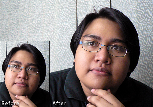
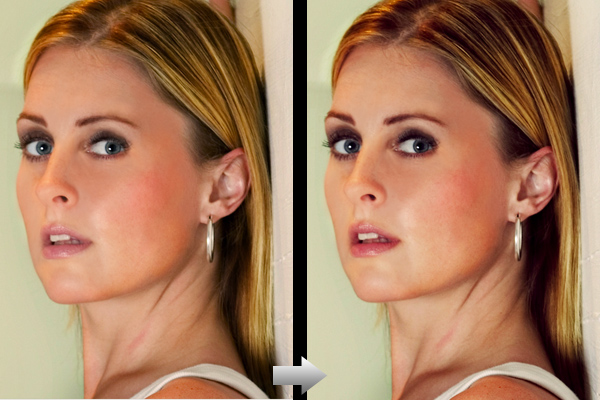
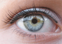
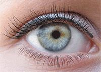
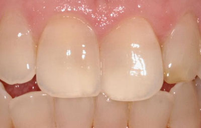
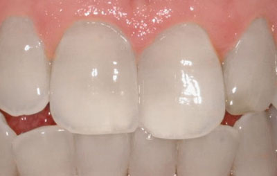
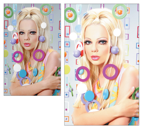
Photo touch up has been an important aspect for both professional and non professional nowadays. This is something most of us with a camera must learned! If you are a web designer or want to walk down designers path, this is a resources you must have. The differences between a photo that doesn't applied these touch up techniques and those that does can be seen obvious. Don't believe me? Watch the video below for some extreme Photoshop makeover. Definitely inspire you to see what resources i have installed for you!
This article will try to provide you with model photo touch up techniques which uses Adobe Photoshop that are both awesome and useful. The article will be split into few sections for easy navigation to bring you the place you want to touch up on your photo! Ready to make over?
P.S: These are all pure articles for Adobe Photoshop touch up make over techniques.
Skin (Touch up)
Perfect Skin
Flawless Flesh: Skin Repair & Reconstruction
Airbrush
Photo Retouching
Super Fast and Easy Facial Retouching
Retouching
Retouch Yellow Skin
Smooth Skin
Beauty Retouching
Romantic Glow
Portrait Retouching for Beginners
Tone Down Highlights
Beauty Retouching
Make up in Photoshop in 10 min
Quick and Effective Facial Photo Retouching
Face
Apply Eye Make-up
Removing Wrinkles, blemishes, acne or just fix up any skin problems
Adding Beards & Stubble to a Portrait Tutorial
Reducing 5 O'Clock Shadow And Beard Stubble
Apply Makeup Digitally
Removing Freckles
Removing Wrinkles or Bags Under Eyes
Eyes
Make eyelashes thicker
Change Eye Color
Shadowy, Sultry Eyes
Nose
Easy Digital Nose Job In Photoshop
Digital Nip Tuck
Smaller Nose
Hair
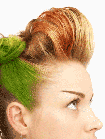
Changing Hair Color
Change Hair Color
Phoenix Hair Effect
Graying hair
Swapping hair to create a different look
Removing Hair Roots
Teeth
Whitening Teeth & Eyes
Whiten Teeth
Whiten And Brighten Teeth
You are a Good Dentist
Whitening Teeth the Professional Way
Body
Remove a Tan Line
Bigger Bustline
Trimming weight off with the Liquify tool
Removing Love Handles (Spare Tires)
Change a Person’s Body (aka The Virtual Boob Job)
Eliminate Cellulite
Hands
Nail Painting
Longer Nails
Manipulating nails by increasing length & changing shade
Removing Blemishes
Remove Arm Hair
Full Touch Up
Beautify a Face
Beauty Retouching in Photoshop
Basic Model Retouching
Simple photo adjustment manipulation
Comprehensive Skin and Facial Enhancing
FACE MAKEOVER
Age Progression
5 Really Easy, yet Essential Photo Retouch Techniques for Photoshop Beginners
Tutorial: How to make your own simple and nice Slider with jQuery Part 2
In my previous tutorial on how to create a Slider with jQuery, i illustrated the concept to build up an jQuery Slider easily with a few line of jQuery code and an explanation on how it is being done. But in my previous article, it doesn't work as perfectly as this one since our objective is to provide an understanding on how it work. In this article, i will bring out the fully workable version of my previous article. Short to say, this article will contains more information on why the previous one doesn't work as well as what has been found and solved.
Requirement
Before i start this short article (hopefully) there is some requirement that i wish you could follow before proceeding to read further.
- Read the previous tutorial on Slider with jQuery because in this article i won't repeat much on the concept and how it is being done!
- Have basic knowledge of HTML, jQuery and CSS
- Wish to construct a workable jQuery Slider on your own instead of just understanding how it work
The Problem
There are a few things i came across when working on a jQuery Slider from my previous article.
- The scroller doesn't stop when the user mouse up sometimes
- jQuery doesn't support sequence event trigger: means it cannot prioritize which event should trigger when an element has multiple events
- The mouse will always pull to the starting line of the scroller
This is as far as i remember for what happen between the current and the later version differences. Although both work quite well.
The Solution
The CSS and HTML are perfectly the same! The only differences occurred on the jQuery codes and below listed what has been done to eliminate the above issues and the final code in jQuery.
- The mouseup event handler was embedded within mousemove event handler. This means that mousemove must first initialize before mouseup will be triggered which is not always the case. Thus, the two event handler were seperated.
- Since jQuery doesn't support priority event triggering, i used a boolean variable to stop the movement and wait for mousedown event to complete before it can start the other instruction within the mousemove event. This will solve the problem where mousemove initialize first before the distance between the scroller and starting point being calculated in mousedown event.
- The reason why it always pull to the starting line was because it was instructed to do so. I did not calculate the disance between the scroller and starting point which is required to tell the program to start at any point occurs within the scroll bar!
The above explanation might not help you understand a single bit at all! But the below code will definitely assist you in relating the explanation above.
$(function(){
	var myoffset = $('#scroller').offset();
	var myxpos = parseInt(myoffset.left);
	var width = parseInt($('#scrollbar').css('width')) - 196;
	var action = false;
	var startpos = 0;
	var move = 0;
	var scroller = 0;

	$().mousemove(function(e){
		move = parseInt(e.pageX-myxpos);
		$('#scroller').mousedown(function(){
			action = true;
			scroller = parseInt($('#scroller').offset().left);
			startpos = move - (scroller - myxpos);
		})
		if(action)
		{
			move = move - startpos;
			if(move < = 0)
				move =0;
			if(move >= width)
				move = width;
			if(action)
				$('#scroller').css('left', (move)+'px');
		}
	})
		$('*').mouseup(function(){
			action = false;
		});

});
Let's see how do i explain this. Let's do it in point form similar to the problem we have.
- Notice '$('*').mouseup(function(){...' was placed outside instead
- Notice 'if(action)......' was there to stop all instruction from initializing before '$('#scroller').mousedown(function(){..' completed'
- Notice '$('#scroller').mousedown(function(){ ....' contains variables 'scroller' and 'startpos'
I think this will clear out what my messy explanation has just caused. After these three has placed up, you will have a full and nice version of jQuery Slider from my previous article.
The Demo
It will be pretty confusing whether there is really a full version of jQuery Slider without using a jQuery Plugin. Thus, i have prepare two demo for you. The first one is the understanding demo and the other one is the current full version demo!


